


"I strategically increased the size of frequently used buttons and placed them closer to the users’ initial
touch points. For instance, I enlarged the primary call-to-action buttons and positioned them within
easy reach to minimize the movement distance required."
"Fitt's law states that the time required to move to a target area is a function of the distance to the target
and the size of the target."
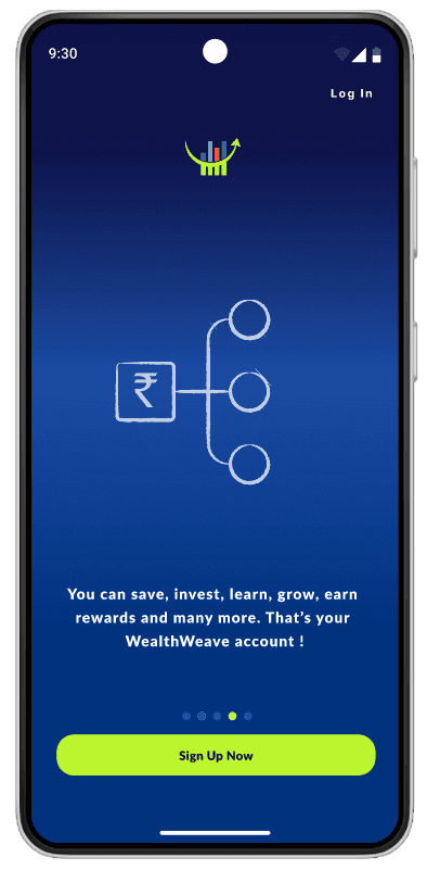
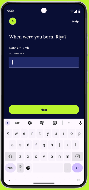
Users are introduced to common financial terminologies and their brief definitions on the splash
screens itself.

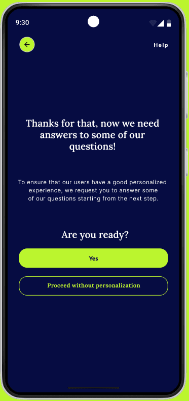
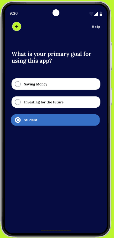
Users can completely personalize their savings and investment experience by answering a few
questions during onboarding and can manage these preferences later from their account settings.


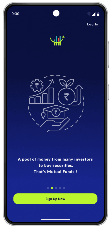
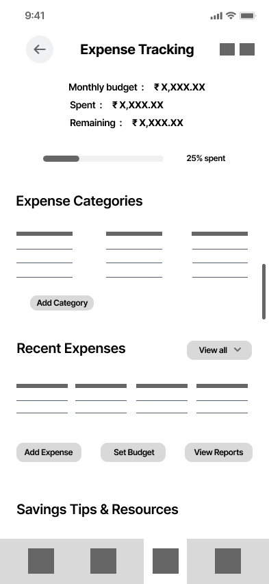
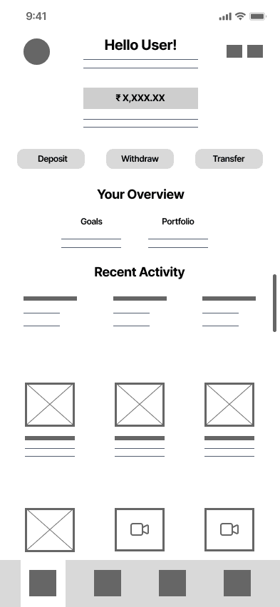
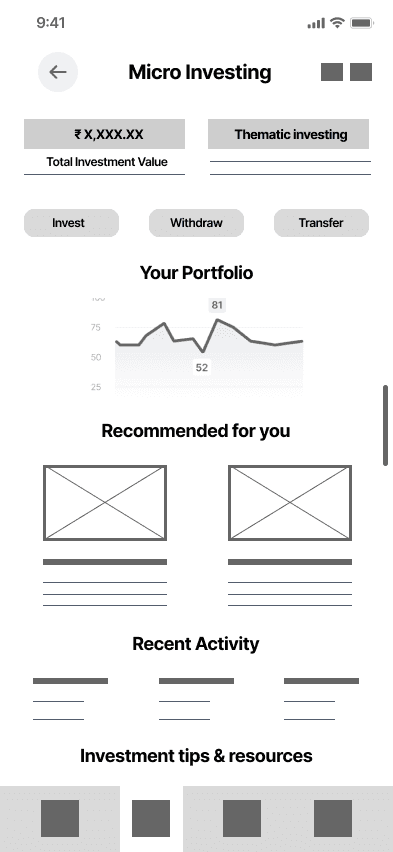
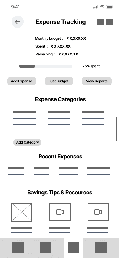
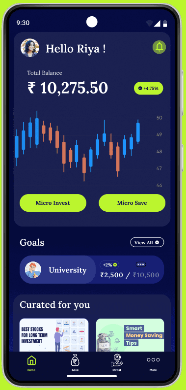
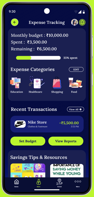
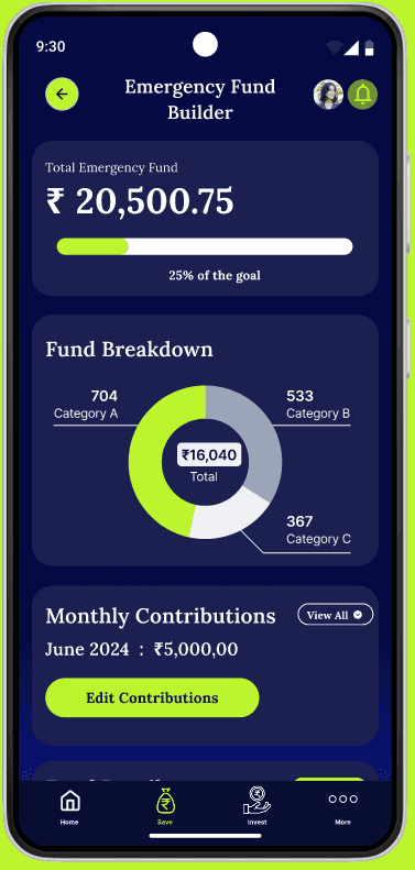
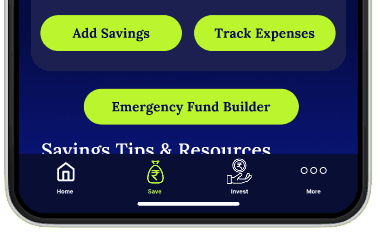
Users have dedicated sections for managing their expense, micro investing, micro saving and
building emergency funds.

Crafting Characters: The Journey of Customer Profiles
From this research, I developed two distinct user personas Veronica and Rohan that encapsulate the diverse needs and goals of our
audience. Veronica wants to try her hands on micro investing for the first time and Rohan is a man with responsibilities looking for a
simple and time saving user experience.
With my information architecture solidified, I turned my attention to craft the journey itself : the user flows. Like choreographers
orchestrating a ballet, I aimed to choreograph seamless interactions that would lead users from entry to fulfillment.


Energized by the wealth of ideas generated during the Crazy 8s session, I set out to shape these concepts into a coherent
structure: the information architecture. I began to organize my ideas into logical flows and pathways.
Under profile section, users will further be able to manage personalization in an elaborated way.
Under micro investing section, users will be able to view options like investment options, portfolios, performance tracking,
overview and features like thematic investing.
Under education and resources section, users will be able to see sub sections like articles, workshops, podcasts, finance
dictionary and other important tools like retirement, interest calculator, budget planner etc.

User Journey Safari

SOLUTION
WealthWeave is an app specifically designed for Gen Z and Millennials, allowing users to fully personalize their savings and investment
experiences. It provides tailored tools and insights based on individual preferences. Additionally, WealthWeave features a dedicated
section for tracking and managing expenses, a knowledge hub for financial terminology, and an emergency fund builder.


User wants to set up and use
emergency fund builder

User wants to track and manage
their expenses

Project Type
April 2024 - June 2024
( 12 weeks)
Micro Investment and
savings app concept
My Role
Product Designer
Project Timeline
Project Stack
Figjam, Figma, Notion
Framer
PROBLEM
Millennials and Gen Z face challenges in developing enduring savings
and investment habits
Although financial literacy and investment interest are growing among millennials and Gen Z, many face challenges in developing
enduring savings and investment habits due to perceived barriers and a lack of accessible, tailored tools. Trying to address this gap
to help them build sustainable financial practices and secure their financial future.
The Journey Begins: Discovering User Needs
RESEARCH
Carrying out survey
After surveying 23 individuals and analyzing their responses, I found several primary reasons (pain points) why users struggle to
establish sustainable savings and investment habits which defined my user goals :
Inefficient maneuverability/lack of custom options
complex jargon
insufficiency in informative material regarding investment and risk elements
absence of reward features

Before delving into design elements, I aim to investigate the psychological factors and motivations that drive goal setting. So, I
developed a survey to identify the issues users encounter while developing savings and investment practises.
65% of contributors frequently deal with obstacles like behavioral problems,
lack of knowledge, fiscal limitations, apprehension of hazards, and a lack of
motivation or rewards.
60% of people feel that there's a need for an uncomplicated and fun
micro-investment and savings tool, since they're open to sharing their
personal finance data, encompassing income and regular/periodic costs.
Key insights from survey responses

Take the survey on Google form
View survey results in Google sheets
Interacting with the users through interviews
Do you have any concerns or reservations about micro-investing that you would like
addressed?
Can you describe a scenario where having a robust savings and investment strategy
would significantly impact your life positively?
Can you walk me through your typical process for categorizing and monitoring your
expenses?
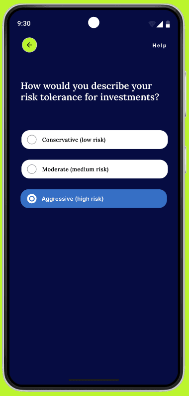
How would you like to balance risk and reward in your investment portfolio? Are you
more risk-averse or willing to take on higher risks for potentially higher returns?

Let's group similar notes together
I then organized my survey and interview data to gained some valuable insights that would surely help toshape my design decisions.
There were three themes which I could figure out namely : Challenges, Needs, User interface decisions
Time for the clash of titans : Analyzing our competitors
With an abundance of micro-investment applications accessible in the market, I executed a comparative analysis to comprehend
their distinct selling points (USPs), functionalities, benefits, and drawbacks. Below are some crucial points of interest.


Features
No social and community features
USP
Acorns USP lies in its automated investing
and savings features
Advantages
Diversified Portfolios
Recurring Investments
Found Money Program
Disadvantages
Fees for Small Accounts
Limited Investment Control
Lack of In-Depth Analysis Tools
Customer Service Limitations
Features
No tax efficiency features
USP
It simplifies savings by automatically
analyzing spending habits and effortlessly
transfers small, manageable amounts into a
secure savings account.
Advantages
Automated savings
Goal tracking
Overdraft protection
Disadvantages
Subscription fee
Limited Investment Control
Potential over-saving
Features
No account insurance feature
No social and community features
No gamification
USP
Betterment's USP is its goal-based investing and automated portfolio management, which uses advanced algorithms to optimize returns and minimize taxes for users of all experience
levels.
Advantages
Automated Portfolio Management
Goal-Based Investing
Tax Efficiency
Disadvantages
Management Fees
Limited Investment Choices
No Direct Stock Trading
Account Minimums for Premium Services
Features
No auto investing feature
No portfolio management tools
No risk assessment and guidance
USP
Qapital's USP is its unique approach to savings
automation through customizable rules and goal-
based savings, helping users effortlessly save
towards specific financial objectives.
Advantages
Customizable Savings Rules
Goal-Based Savings
Automated Savings Transfers
Integration with Banks and Services
Disadvantages
Subscription Fees
Limited Investment Options
Complexity for Some Users
Potential Banking Integration Issues
DEFINE
Concluding the empatize/research phase !!
In conclusion, the empathize phase of my project aimed to deeply understand the needs and behaviors of our users.
With a hand full of insights about user needs, pain points, choices and much more I move forward to the define phase.

Veronica / 18 / Student
Veronica, a second-year B.Tech student, relocated to Delhi a year ago
to pursue her engineering degree. Hailing from a middle-class family,
her parents secured an education loan for her studies since they both are
salaried employees. Veronica receives a modest allowance from her family
to manage her monthly expenses. With aspirations to begin micro-saving
and investing, she seeks to cultivate financial independence despite her
limited resources.
Frustrations / Pain Points
Poor expense management.
Limited understanding of financial terminology.
Limited access to financial planning resources.
Fear of risks while investing.
Shortage of incentives.
No rewards in return.
Confusing user interface.
Poor navigation/accessibility within apps
Rohan / 28 / Working Professional
Rahul, a marketing professional residing in Mumbai, is married, and both
he and his wife work, both remain very engaged with their work. He
occasionally faces challenges in managing multiple tasks simultaneously.
Additionally, he is considering family planning and aims to establish funds
for his future child. He frequently engages in reading about stocks and
financial matters and keep looking out for simpler resources available out
there.
Frustrations / Pain Points
Because of his busy schedule, he doesn't have sufficient time to
efficiently monitor his household expenses.
Limited investment growth opportunities.
Taxes applied on various platforms.
Security of his and his family's personal information.
Existing apps lacking personalized features.

With my personas vividly painted I embarked on the next chapter of our journey: crafting their digital adventures through customer
journey maps. As I started mapping these journeys, patterns and opportunities emerged. I identified key moments of truth—critical
touchpoints where user satisfaction could soar or stumble. Each map was a tapestry of insights, illustrating where my design
interventions could make a meaningful impact on user experience.
Let's start with Rohan's journey
Now, let's have a look at Veronica's journey

Empathy Map for Veronica
OUTCOME


After gathering all the touch points and pain points I conducted a 5 why analysis for each of my user's pain points to unravel the
mystery until I managed to reach the core issue. Each why brought me closer to the root cause.
Root cause explorer - finding the "5 Whys" ?

For Veronica's pain points
For Rohan's pain points
After uncovering the root cause of user frustration through my 5 Whys investigation, I framed several how might we statements to
turn my research findings into actionable design challenges which helped me taking my process forward.
Framing the HMW statements
HOW MIGHT WE
Moving to ideation
In the define phase I crystallized key user insights and pain points which helped me in providing a clear focus for my
design efforts. This phase helped me in synthesizing research data into some actionable problem statements and
set the foundation for ideation. Defining my user goals to be simplifying the process of expense tracking and coming
up with some convinient and time efficient solutions for busy individuals so that they can start to prioritize and manage
their finances.
So, taking my HMW statements as invitations to innovate. I did the crazy 8 session with 4 more people to get the splash of diverse
and inventive ideas - some practical, some imaginative, all valuable. These Crazy 8s sketches laid the groundwork for the next
phase of my design journey, turning my HMW statements into tangible design possibilities
Crazy 8's - 480 seconds of pure creative explosion


simplify the process of tracking expenses and clearly
communicate its benefits to overcome the belief that it
is time-consuming or complicated?
create convenient and time-efficient solutions for busy
individuals to prioritize and manage their savings
and investments?

Information Architecture
Defining user flows


User wants to register themselves
and start onboarding
User wants to access
financial education
resources
User wants to access and set
personalized savings goals
User wants to access and
practise personalized
micro investing
I also interviewed 5 people : 3 college students, 2 working professionals
"Ease of use is paramount. And it should be secure and trustworthy. Flexibility is also
important. I'd prefer a platform that allows me to invest small amounts regularly,
giving me the freedom to start with minimal funds and gradually increase my investment
over time as I become more comfortable with the process."
"An intuitive user interface and seamless navigation is key for me. And goal tracking
functionality would be essential. Being able to set and track progress towards financial
goals sounds attractive. And a feature that analyzes my risk tolerance, financial objectives,
and current portfolio to provide tailored investment suggestions would save me time and
potentially improve the performance of my investments."
Some responses to look at
Empathy Map for Rohan
Some key takeaways from the empathy maps and personas
Veronica wants to begin with savings and investment practises but hesitates due to their complex interfaces, also
currently she tries to monitor her expenses manually but struggles with consistency.
Rohan wants to efficiently manage and monitor his household expenses but fails to do so beacuse of his busy
schedule, he also aims to estabilish a financially strong future for his family with minimal effort.
High fidelity wireframes
With my paper wireframes serving as the foundational blueprint, I embark to bring my vision into life by combining the best of the
explorations to form high fidelity wireframes. I immersed myself into refining details, I tried to craft each click and interaction very
carefully, tried to transform my concepts into tangible design elements.
High fidelity wireframes
Low fidelity wireframes
With my user flows meticulously plotted, I transitioned to the next phase of our design journey: crafting the blueprint for my interface
through low-fidelity wireframes. Armed with markers and sketch pads, I embarked on translating my user flows into visual
structures. Each wireframe was a rough draft, a skeleton outlining the placement of elements and functionalities without the
distraction of visual details. From login screens to product pages, I mapped out the flow of information and interactions,
prioritizing clarity and usability.

My top 3 takeaways from Crazy 8
Personalized onboarding setup for users which they can also edit and manage later on according to thei preferences.
A dedicated section to emergency fund builder.
Including features like : debt tracker, interest and retirement calculator, financial educational resources
Visual design elements
IDEATE


Icons & Typography
Ag
Lora
Ag
Lora
Logo

0D113F
17258A
18489F
BBF52E
18489F
Colors
Flow for accessing home screen, micro investing and savings screen, expense tracking screen and emergency fund builder followed by some explorations of the same flow.
Final Solutions / Outcomes


Inclusion of Fitt's law


Designs that were trashed !
I came up with few designs initially but ended up trashing them as they were not very aesthetically pleasing to me, also I came across
some readability issues with these designs. Let me know what you all think about these as well.
Conclusion
What did I learn?
Working on a complete project of app development was tough but a fruitful journey.
Got my hands on conducting user surveys and interviews to gather valuable insights.
Learnt to be flexible and adaptable to changes and new information throughout the project.
Finally, I would say that making a product both aesthetically pleasing and at the same time user friendly is difficult.
What were the challenges that I faced?
Experienced self-doubt and questioning my abilities and decisions throughout the project.
Ensuring visual and functional consistency across different parts of the project, especially when working on different aspects
simultaneously.
What I could have done better?
Initially I also thought of exploring and adding an augmented reality feature in my product but was not able to complete the
research eventually so, I had to drop that idea but in the next iteration I will try to add this up and would love to see how it is going
to impact
I would also work on improving my visuals further and do more iterations based on user feedback.
I will take a leave on Benjamin Franklin's quote, “Tell me and I forget. Teach me and I remember.
Involve me and I learn.”
For any feedback, suggestions or collaborations reach out on Linkedin